
Beautiful paint colors for any room in your home. Various colors to consider and why they are so great! Paint colors for the interior and exterior of your home.
I’m here today to share some of my favorite paint colors with you. In fact, they are the paint colors all around my home!
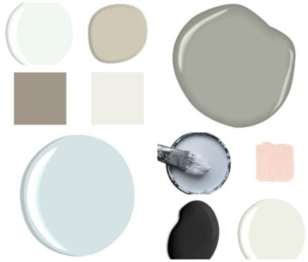
Paint Colors
I’m a creature of habit and I tend to stick to colors I like. Why not when you know they look good and go well with other colors and hues?!
Welcome to Refashionably Late. If you are new here, please join 24k+ subscribers and followers for weekly DIY projects & ideas! I’d love to get to know you and answer any questions you may have. You can also follow along on Pinterest, Instagram, & Facebook.
I’m a big fan of Sherwin-Williams and Benjamin Moore paints so that’s pretty much what I use in my home.
I am going to share with you the interior and exterior color scheme of my home! I’m going to break it down to the inside of my house and the outside of my house and then the in-betweens.
Inside
A large chunk of my house is painted Requisite Gray by Sherwin-Williams. I believe it to be the best gray color on the market.
It’s a warm gray, not cold like a lot of grays can feel. I would say it’s on the taupe side of gray rather than the bluish side.
Kitchen
This color is in all the main living areas of our home as our floor plan is quite open. I also put it in our master bedroom.
Sherwin-Williams Requisite Gray & Zurich White
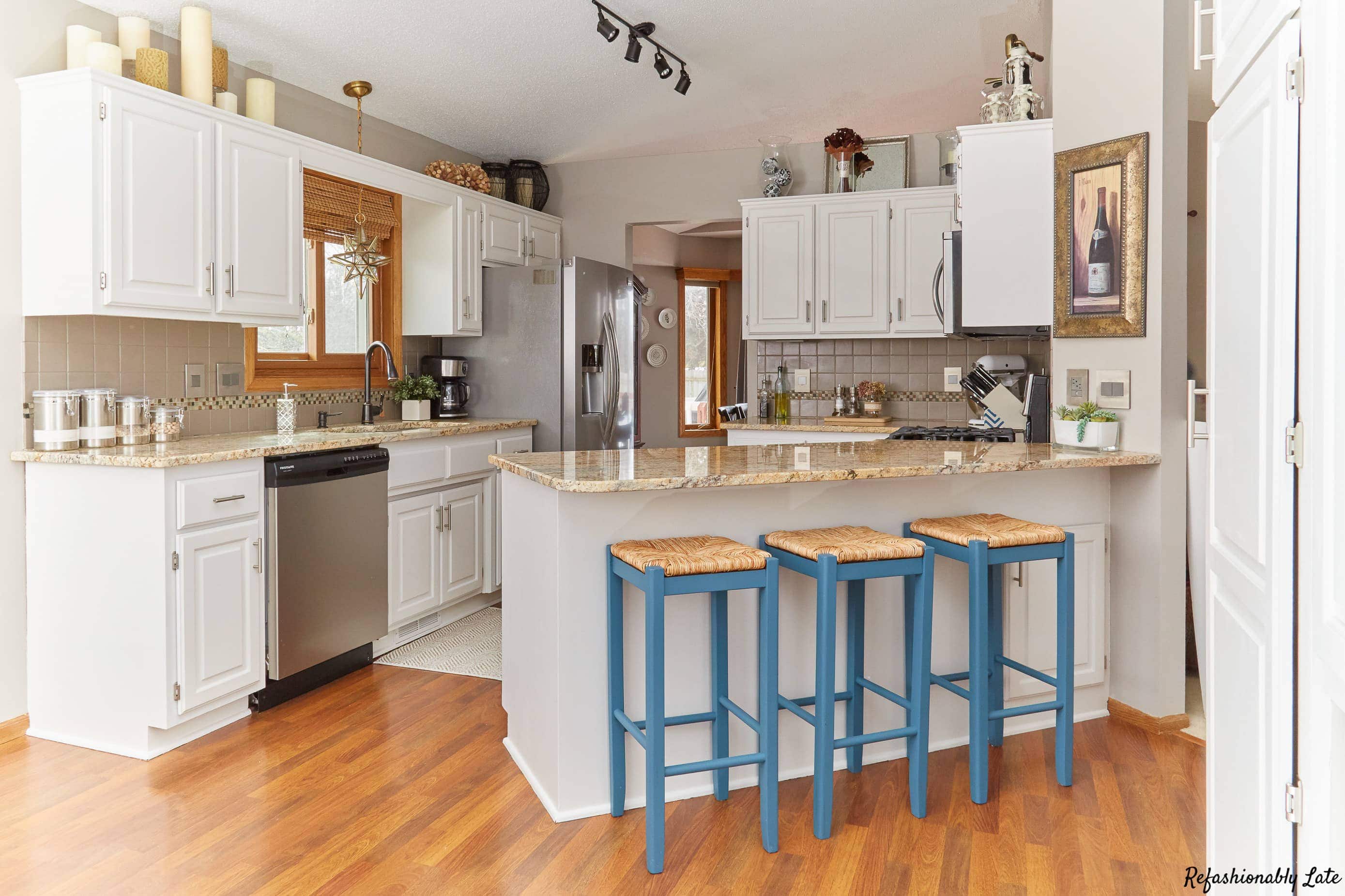
We have done a few updates to our kitchen! I’ll update very soon! We have new flooring, new chairs and all the woodwork is painted! 🙂
I have also fallen in love with Zurich White from Sherwin-Williams. My kitchen cabinets and all the woodwork in my home are Zurich White.
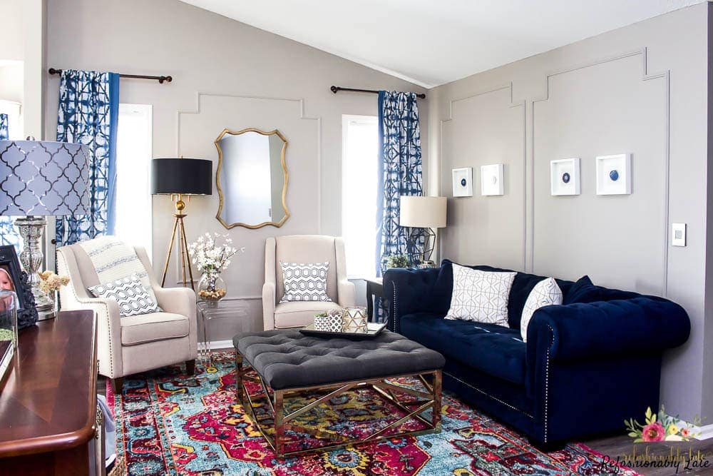
Living Room and Hallway
I recently added some DIY board and batten to our hallway upstairs. I kept the Requisite Gray at the top and painted the board and batten Zurich White.
Guest Room/Office
Next, in guest room number one I used two different paint colors. We had to repaint all of our ceilings in our home and I didn’t want to mess with cutting in. So, I used the same flat Extra White paint on the walls of our guest room.
I do like the look of flat paint but I am slightly regretting it because it gets dinged up pretty easily. Unfortunately, suitcases have caused some scratches on the wall.
I then used one of Sherwin-Williams most popular black colors to stencil the wall and paint the stripes in the closet.
Extra White & Tricorn Black by Sherwin-Williams


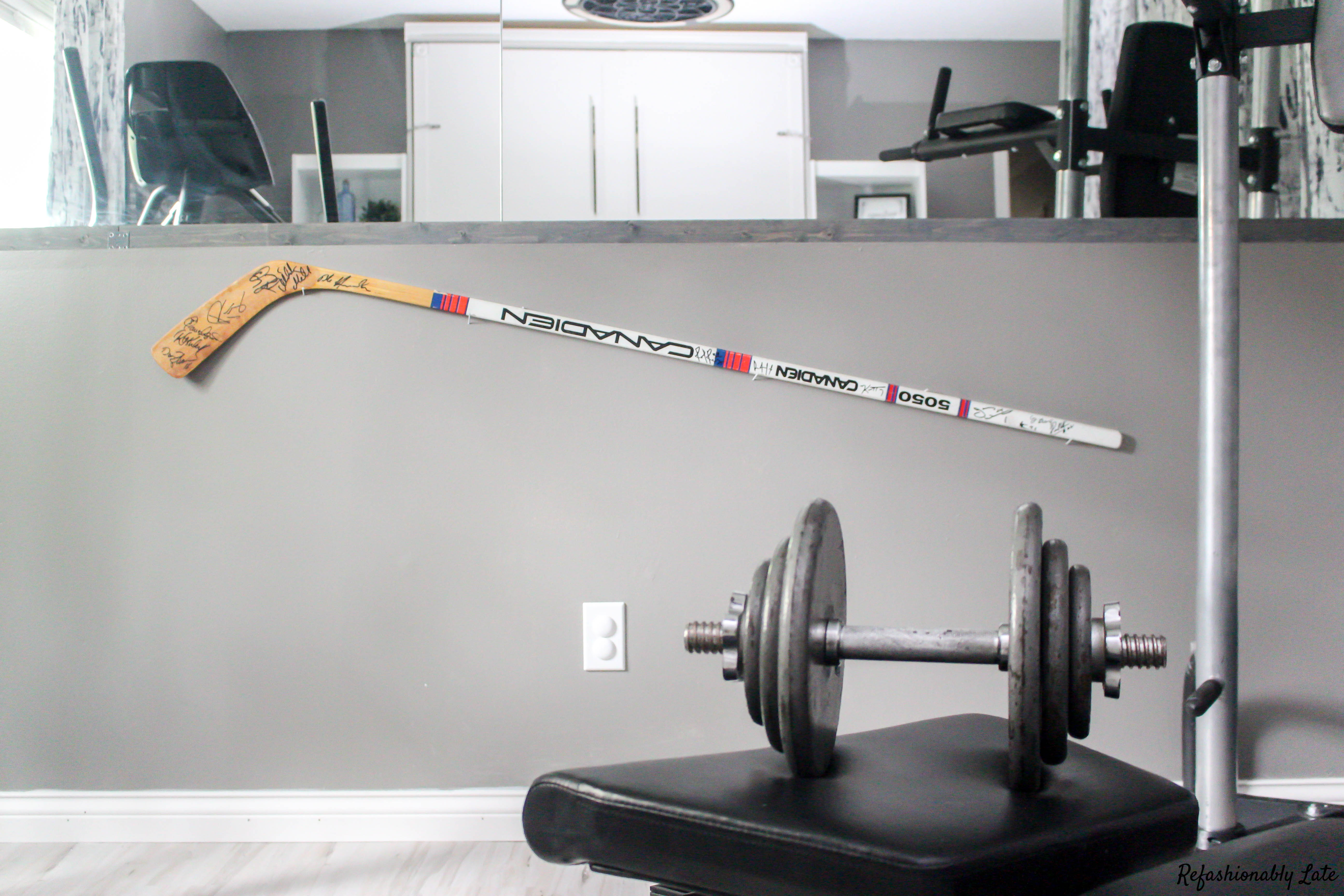
Guest Room/Home Gym
With our second guest room, I wanted to give it a little bit more a masculine look. My husband has always used this room as a bit of a man cave.
I didn’t want to make it all cutesy or feminine because I wanted him to really enjoy the space. Plus, it has become our more frequently used guestroom.
Dovetail by Sherwin-Williams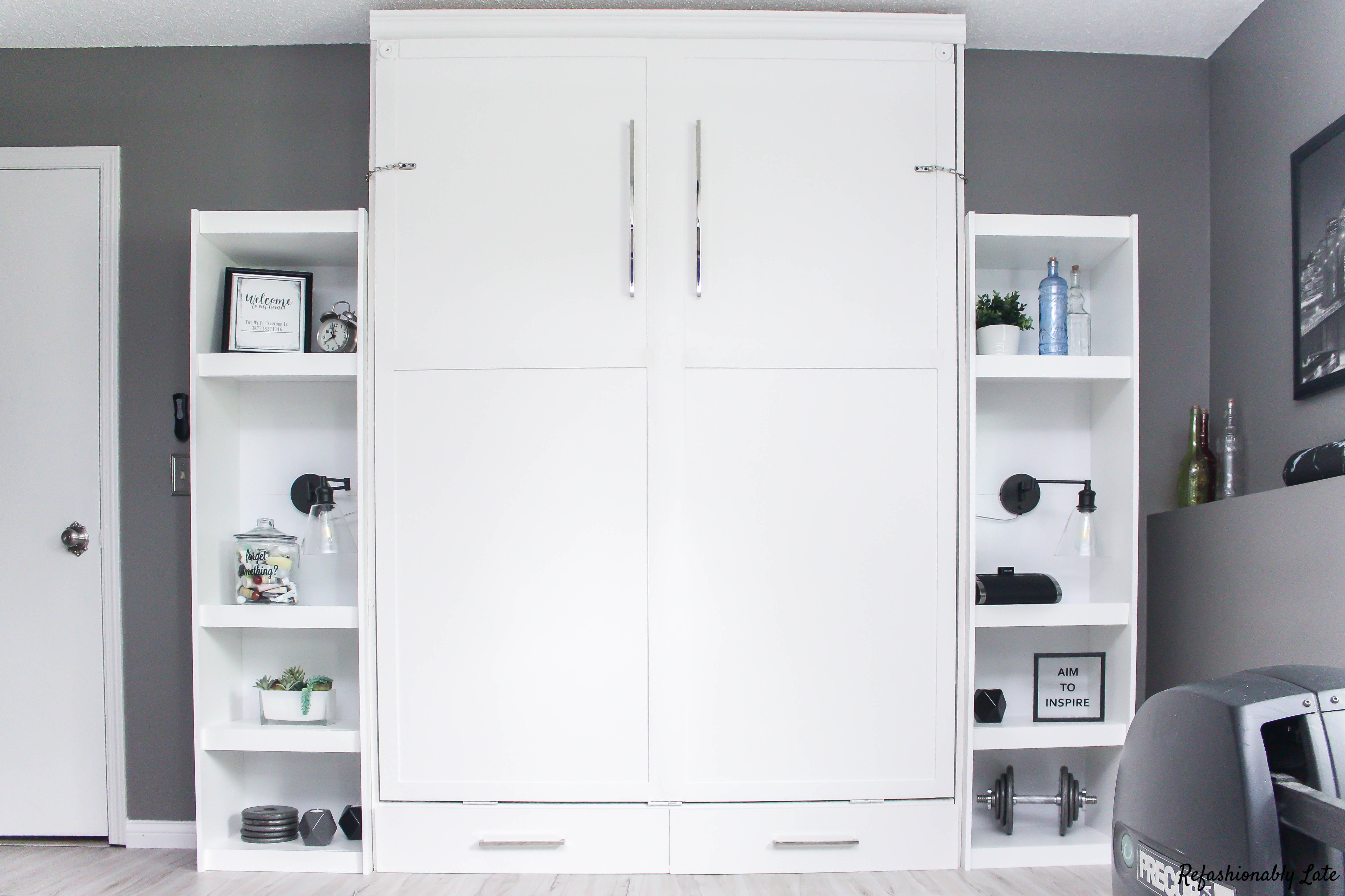
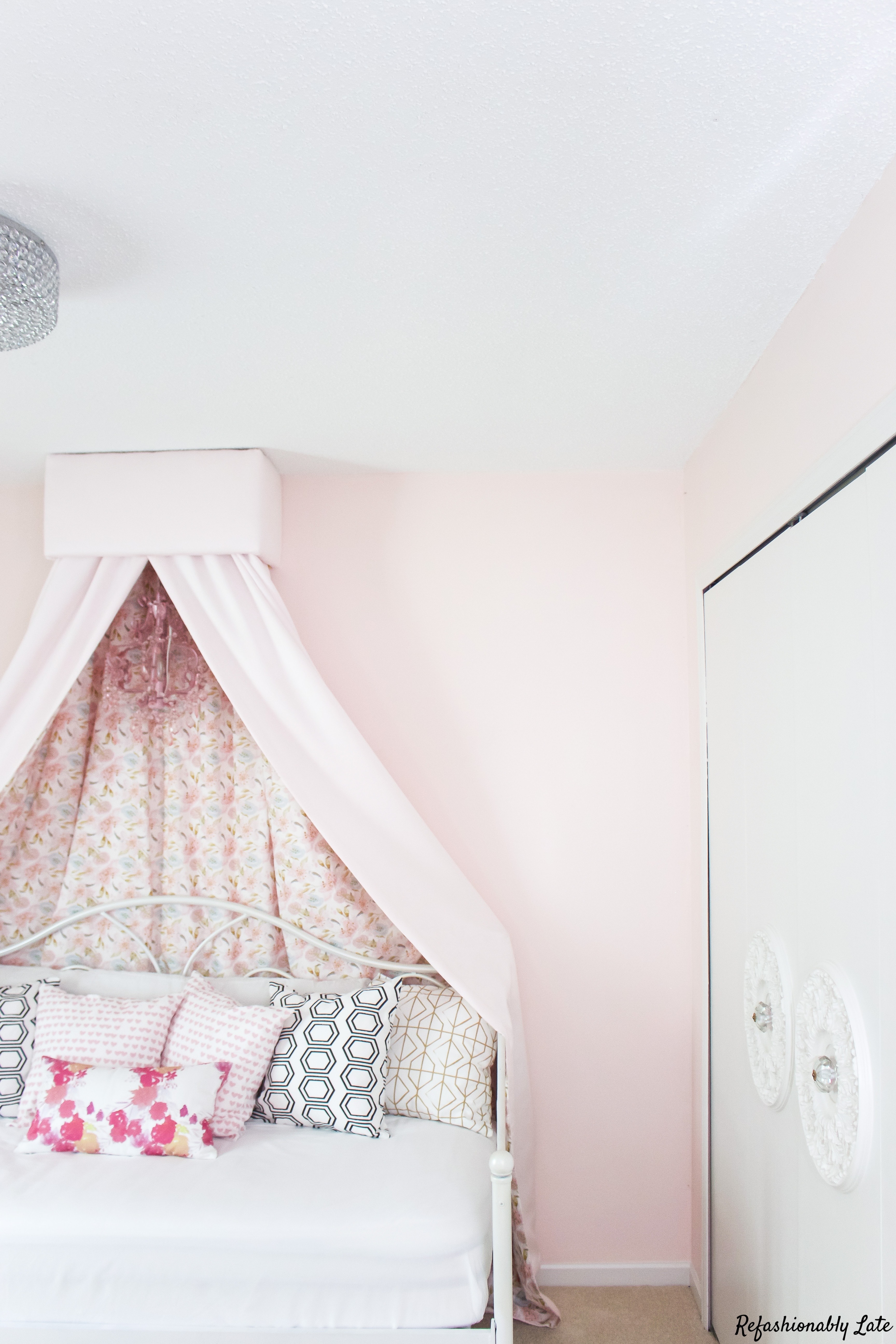
Oldest Daughter’s Room
Next, we will move into my older daughter, Lucy’s, room. This was the first room we painted in our home as I wanted my daughter (and myself) to feel settled.
I went with a very soft pink and I just love this color. Just like I think that Requisite Gray is the perfect gray, I truly believe this is the perfect pink.
White Dogwood by Sherwin-Williams
It’s light, feminine and not too bubblegumish. (Is that a word?) I also added a touch of sparkle by adding Valspar Paint Crystals to the gallon of paint. I love the touch of sparkle it adds to my daughter’s room.
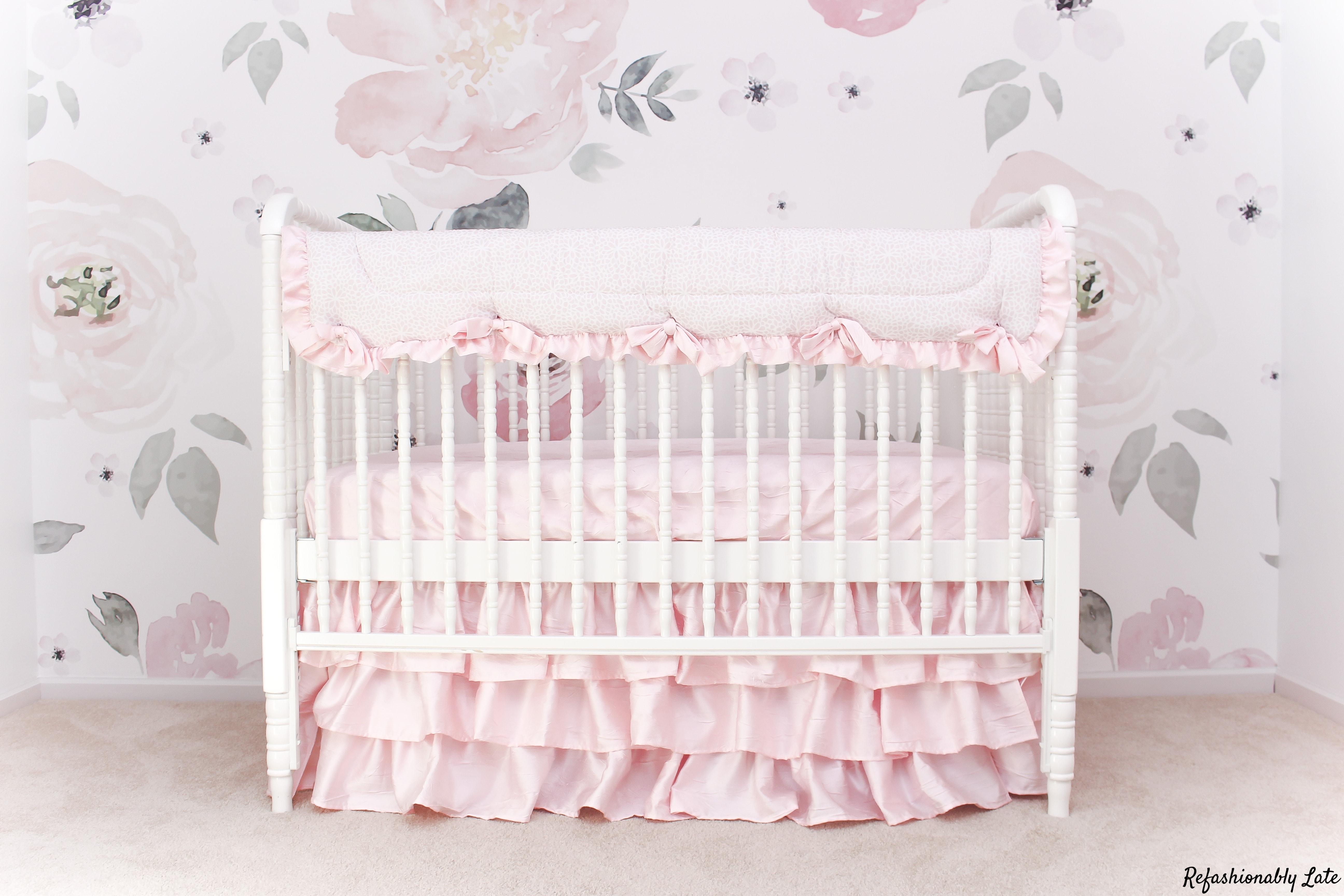
Youngest Daughter’s Room
Now, the main focus of Gabi’s room is her wallpaper. The white paint is just there to compliment the floral wall.
I took a wallpaper sample into Sherwin-Williams and tried to find the closest white to match the wallpaper. Extra White from Sherwin-Williams for the win!
Extra White – Sherwin-Williams
Upstairs Bathroom – Constellation by Benjamin Moore
A few years ago I thought it was a good idea to makeover two rooms while pregnant. Maybe not my smartest moment but, in the end, I was glad to have those projects done.
I’m loving the color Constellation by Benjamin Moore. It’s a beautiful change of color in my home and it’s part of their Aura Bath & Spa Collection.

Outdoors
Let’s move outdoors and I’ll show you the few items we have painted outside. I’ll be honest and say we haven’t done a ton to the outside of our house because I’ve been focusing on the inside but I do have a couple of small projects that we love! 
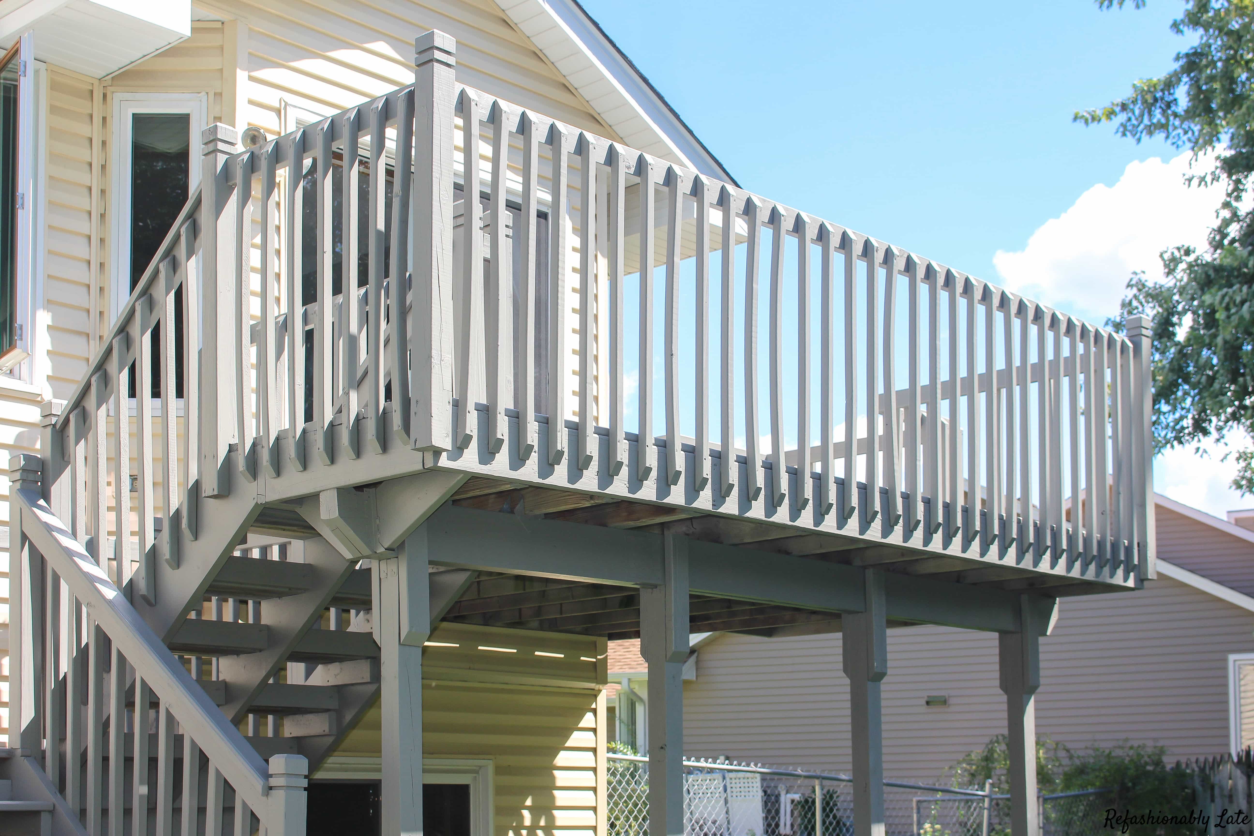
Benjamin Moore Floor and Patio in Light Gray
A couple of years ago we painted our deck with Benjamin Moore Floor and Patio Latex Enamel in Low Sheen in Light Gray.
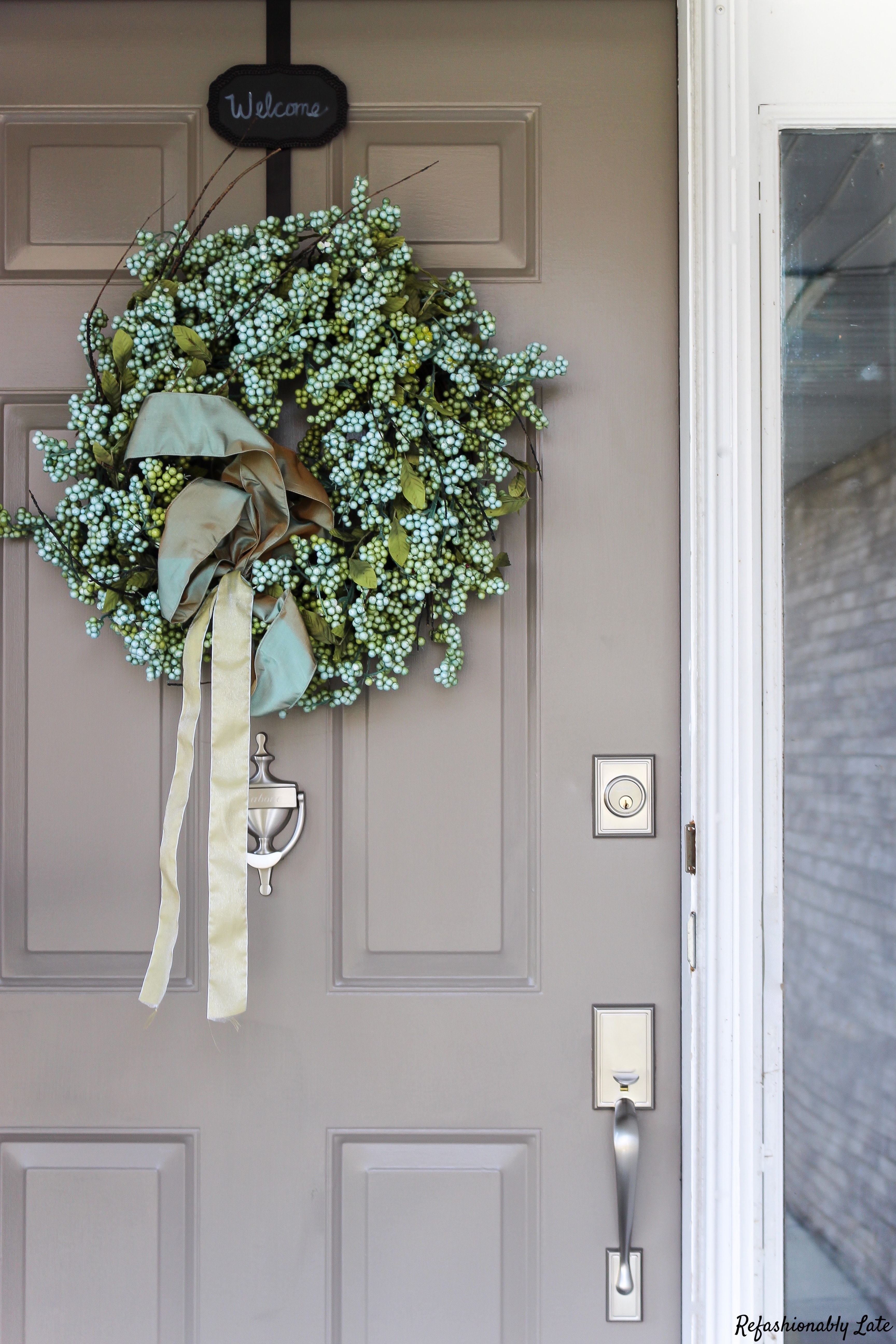
Backdrop by Sherwin Williams
It matches our house so much better than the previous red stain that was on our deck. I also gave our front door a small facelift and painted it Backdrop by Sherwin Williams.
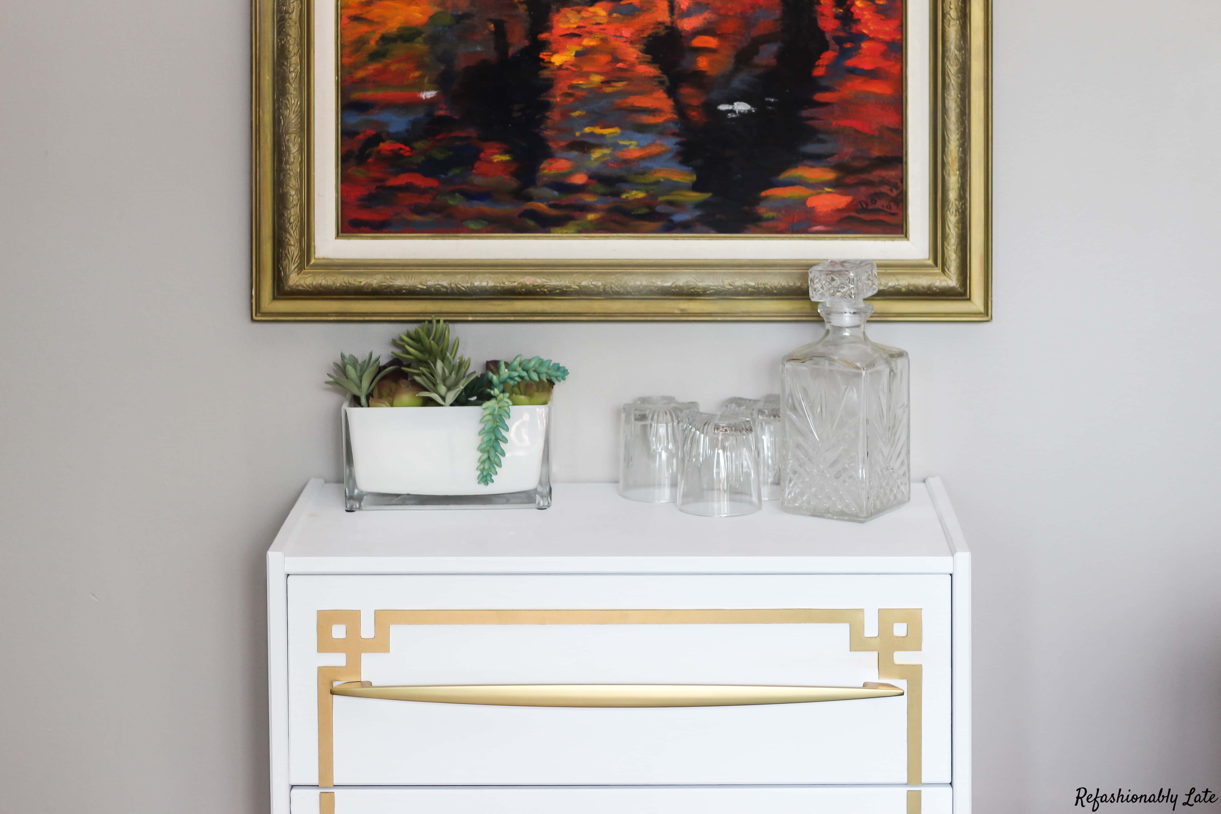
Furniture
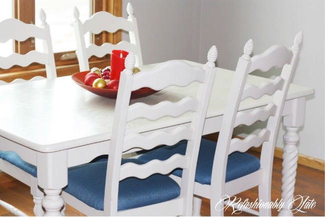
Now I’m about as obsessed with this color as I am Requisite Gray….Accessible Beige by Sherwin-Williams. I love the warm tone to the color and I love that’s it’s white with beige undertones.
Accessible Beige by Sherwin-Williams
It’s a lot creamier than beige which I love! I have used it within a few projects throughout my house: kitchen table, DIY ottoman, DIY Ottoman makeover a second time, and master bedroom shelf.
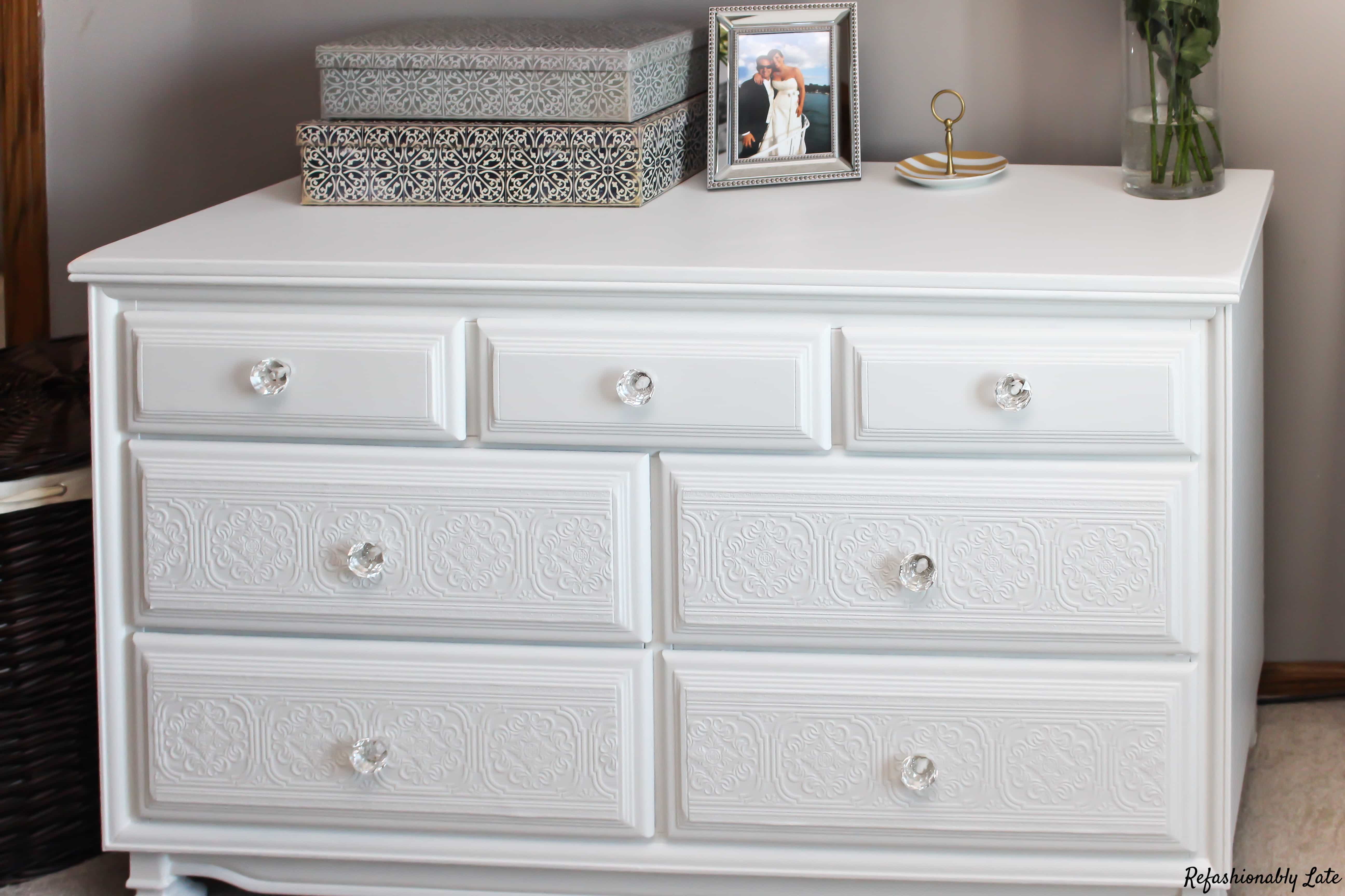
White Dove by Benjamin Moore
I painted a dresser and two nightstands in our master bedroom with White Dove by Benjamin Moore. Since I was (past tense) pregnant at the time so I used their Natura Zero-VOC and Zero Emissions paint. 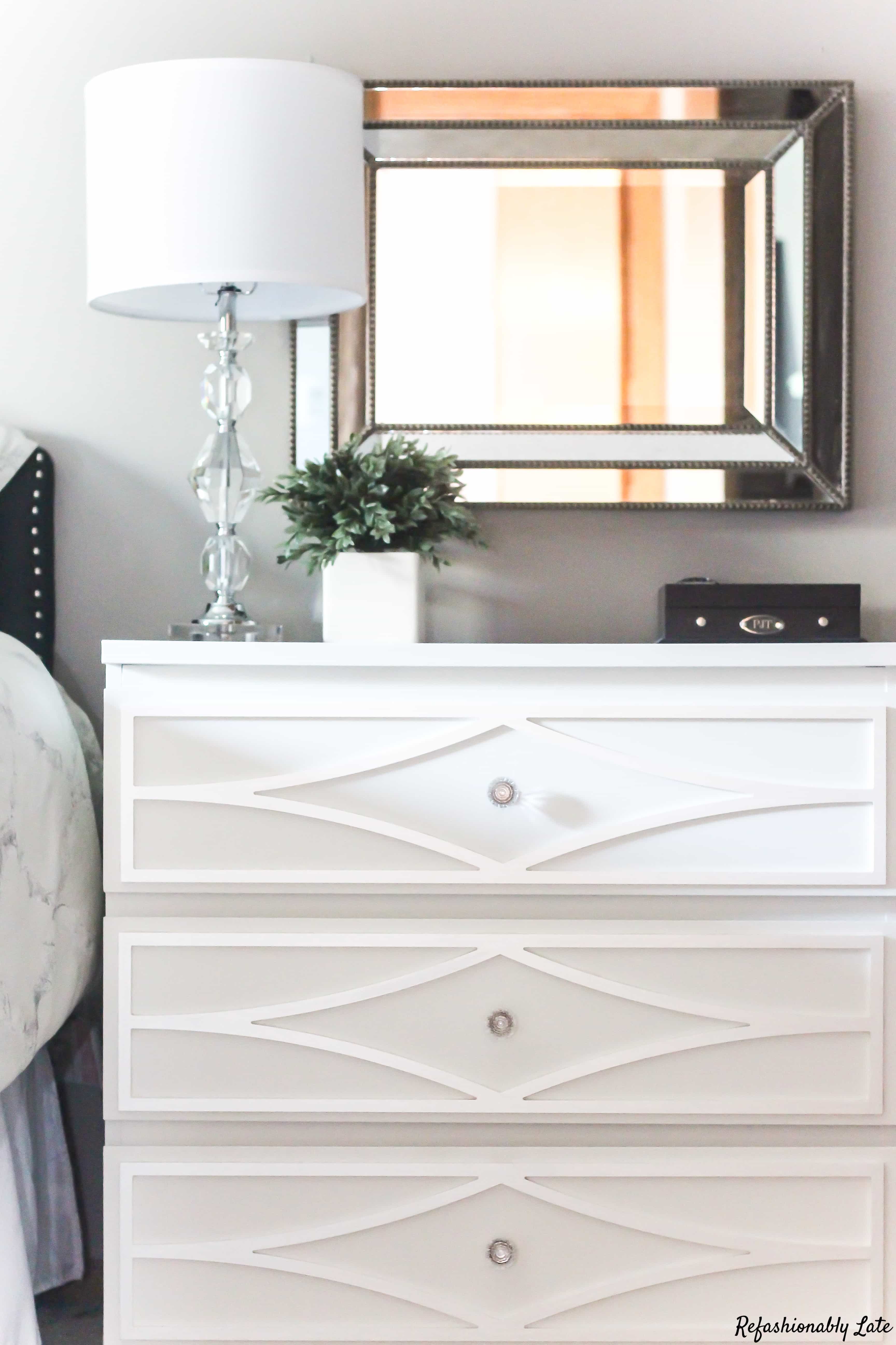
White Linen by Chalkworthy Antiquing Paints
I’ve started using chalk paint here and there as well. I started with White Linen by Chalkworthy. I’ve had so much fun making over an IKEA Rast dresser. I turned it into stemware storage in our Dining Room.
I also used it on an antique dresser for my daughter’s room.

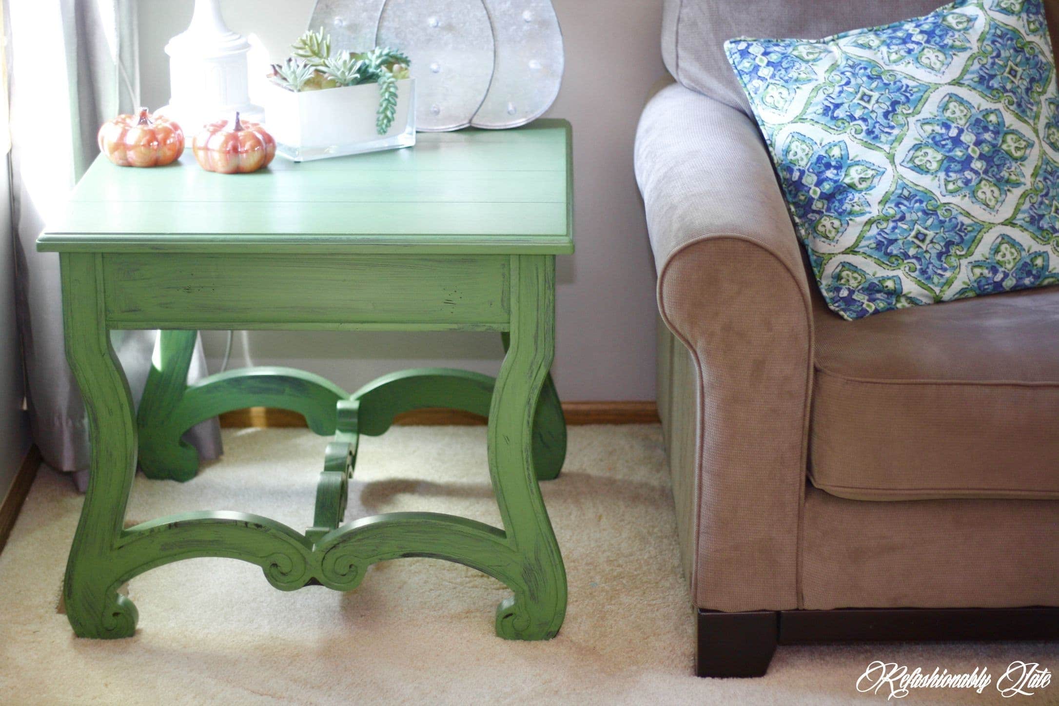
Last but not least, I want to share with you a pop of color I wanted for my living room. I loved the boldness of this color and I loved how it really popped in our living room.
I used Cliveden Pasture by Valspar. Before we got new furniture, I loved mixing greens and blues. I also shared a great tutorial on how to distress a table the easy way!
It has since painted it black and added an intricate design on the top with my Cricut Explore Air 2. I love how paint can completely transform a piece of furniture! It really pops in our newly decorated living room.

So there are just a “few” colors throughout my home! I think they all compliment each other really nicely.
Have you used any of these colors? What’s your favorite go-to color in your home? Check out my favorite items to paint with below!

Many outgoing links on Refashionably Late are affiliate links. I may earn a small commission to fund my Diet Mountain Dew drinking habit if you use these links to make a purchase. You will not be charged extra, and you’ll keep me supplied in caffeine. It’s a win for everyone, really. I only link to products I have tried and love! See my full disclosure here.


I love the look of very subtle colors for a home. If you want to add some color to your home, but don’t want to go overboard, these colors would work wonderfully! I love the very subtle pink color you picked for your daughter. It is so beautiful and classy!
Thank you so much Kendall! I love all of the colors in our home, obviously! 🙂 I love the pink as well! Thanks for reading! 🙂
I have neutrals, too. Floors are either taupe (carpet), or chowder (ceramic). From there, I’ve done most of the public room walls in caribou (a charcoal sw), along with a tad bit of stepping stone (taupe behr). Lots of off white gray semi gloss on trim, a warm white from sw for the bathrooms with white square subway tiles. Just added low sheen subway tile to the kitchen, all the way up to the ceiling, along with browns/grays/whites in a granite, with stainless. Some oak antiques, and leather furnishings. It’s all a balance. Have also carried the same gray/brown scheme outside, just like you say you did. Waiting for the gray metal roof to be done any day now!
Kathleen it sounds like you have a beautiful home and a gorgeous taste for color! I love having my home go together inside and out with the similar color schemes! Thanks for reading my blog!